React Checkbox – Customizable Multiple-Choice Selection UI
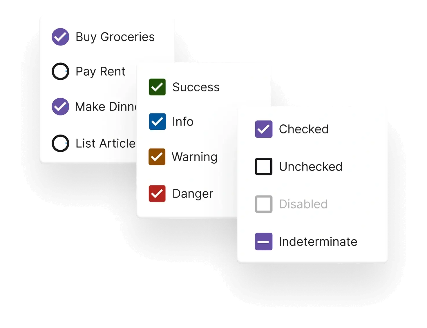
- Extends the HTML checkbox with theme variants.
- Tri-state functionality gives you checked, unchecked, and indeterminate options.
- Custom styling capabilities for all selection states.
Trusted by the world’s leading companies

Overview
The React Checkbox is a custom HTML5 input component for selecting one or more options from a predefined list. It supports an indeterminate state, multiple sizes, customizable label positions, and flexible UI styling.
React Checkbox code example
Get started with the React Checkbox using a few simple lines of TSX code, as demonstrated below. Also, explore this React Checkbox example, which shows how to render and configure the Checkbox in React.
import { Checkbox } from '@syncfusion/react-buttons';

export default function App() {
    return (
    <div className="component-section">
        <Checkbox label='Checkbox' defaultChecked/>
    </div>
    );
}
Checkbox states
A single checkbox toggles between checked and unchecked states. To prevent toggling, use the disable option, which makes it inactive.

Tri-state or indeterminate checkbox
The React Checkbox component includes built-in support for an indeterminate state, allowing developers to represent partial selections within a group. This feature is especially useful in hierarchical or multi-level selection scenarios where only some child options are selected.
Checkbox sizes
The React Checkbox supports small, medium, and large sizes to fit various UI layouts and accessibility needs. Developers can choose the right size based on their design.
Labels
Labels can be added to provide captions for checkboxes. Depending on the desired layout and accessibility considerations, a label may appear either before or after the checkbox. This approach improves clarity and enhances the usability of form elements.
Custom or fancy checkboxes
This component offers full flexibility in customizing its user interface, including the frame, icons, and overall design. It also comes with built-in options for primary, success, warning, info, and error designs, which help clearly represent different states.
Forms support
The Checkbox integrates seamlessly with native HTML form validation. This ensures consistent behavior across form submissions, enabling validation of required fields and improving overall form reliability and accessibility.
Web accessibility
- Fully supports WAI-ARIA accessibility standards to work with screen readers and assistive devices.
- Follows WAI-ARIA best practices for implementing keyboard interaction.
- Was designed using WCAG 2.0 standards for its UI visual elements such as foreground color, background color, line spacing, text, and images.
- Supports right-to-left (RTL) text direction for users working in right-to-left languages like Hebrew, Arabic, or Persian.
Pure React Components
Developed using React’s core principles, this library employs functional components and hooks without any external dependencies.
GRIDS
DATA VISUALIZATION
NAVIGATION
INPUTS
Frequently Asked Questions
Why should you choose the Syncfusion React Checkbox?
Provides tristate support: checked, unchecked, and indeterminate states.
- Seamlessly supports HTML forms.
Allows flexible UI customization.
Has a simple configuration and APIs.
- Supports all modern browsers.
- Is touch-friendly and responsive.
Comes with extensive demos to get you started quickly with the React Checkbox.
Where can I find the Syncfusion React Checkbox demo?
You can find our React Checkbox demo here.
Can I download and utilize the Syncfusion React Checkbox for free?
No, this is a commercial product and requires a paid license. However, a free community license is also available for companies and individuals whose organizations have less than $1 million USD in annual gross revenue, 5 or fewer developers, and 10 or fewer total employees.
How do I get started with the Syncfusion React Checkbox?
A good place to start would be our comprehensive getting started guide.
Rated by users across the globe
Syncfusion React Checkbox resources


Awards
Greatness—it’s one thing to say you have it, but it means more when others recognize it. Syncfusion® is proud to hold the following industry awards.

